What is standard deviation?
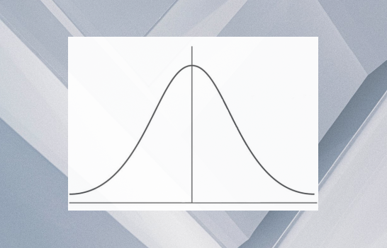
The SAT and ACT test several statistics concepts including things like median, range, outliers, and one of the potentially trickier or mysterious concepts: standard deviation. You may have heard of the term standard deviation before. Maybe you saw it in the context of a bell curve... like this one:
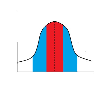
The red region above is one standard deviation away from the mean, or average, (the dotted line, the very middle of this symmetrical bell curve). The blue region is two standard devations away.
We can view standard deviation another way, as well. Commonly, you might see standard deviation depicted graphically in a scatter plot (a graph of all the individual data points in a data set).
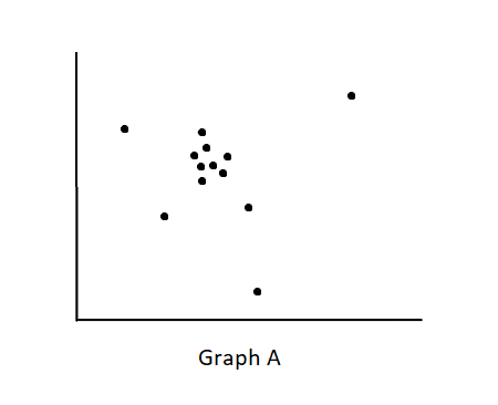
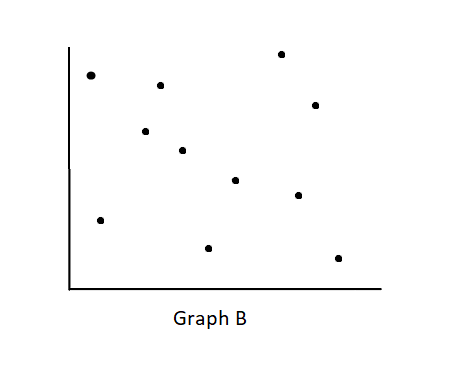
The two scatter plots above are clearly very different from each other: Graph A has its data points clustered much more tightly together while Graph B has its data points more spread out. We could say that Graph A has a smaller standard deviation and that Graph B has a larger standard deviation.
Standard deviation can also be represented in other types of graphs. Take, for instance, the two bar graphs below:
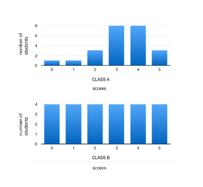
These graphs represent groups of students, with varying test scores. Again, these two graphs are clearly different from each other. Class A has the smaller standard deviation in this situation, and Class B would have the larger standard deviation.
So, what is standard deviation, then? Standard deviation is the average distance from the mean. In other words, it's how closely all the numbers/data are packed together. The more close they are to each other, the smaller the standard deviation. The more spread out and far apart they are, the larger the standard deviation.
If we go back to our two scatter plots, it is clear why Graph A has the smaller standard deviation: it's much more closely packed together, and the average distance from each data point to the mean is smaller. Similarly, in the examples of the two bar graphs, we can see that the scores in Class A are much more closely clustered together and the scores in Class B are more evenly spread out. The average (mean) of Class A might be around 3 or 4, and we can see that most of the scores are right around this average. The average (mean) of Class B might be between 2 and 3, and the scores are more evenly spread out with many scores at the extreme low and high ends, as well, further from that average.
Going all the way back to the bell curve, we can see that the standard deviation being represented in the red region is the distance from that average value. We could flatten out the curve and make it look like this:
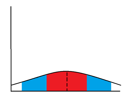
Flattening out the curve is basically distributing the data points more evenly, spreading them out so that there are not so many data points clustered close together, right next to the average. And, when we do this, we can also see that the standard deviation, the red area, has widened. In the original, classic bell curve, we have a smaller standard deviation, while in the second, flattened curve, we have a larger standard deviation.
So, that's basically everything you need to know about standard deviation for the SAT and ACT. Typically, questions involving standard deviation will ask you to determine which set of data, graphs, tables, etc. has the larger or smaller standard deviation or how standard deviation might change if you manipulate the data in some way. Now, you should be prepared for any question involving standard deviation!
